
The 3 most commonly overlooked parts of your website (and how to fix them)
So many brilliant business owners get stuck on how to structure their website. And this leads to an often confusing and overwhelming user experience.
But clarity really does matter.
Your website has one job: guide people to take action. But without a clear structure, visitors get lost long before they reach the good stuff.
Most DIY websites fall down in the same three areas: the header, the hero, and the footer.
Here are the three essential sections of your site that shape how people navigate, understand, and trust your business. Get these right, and your entire website suddenly feels clearer, calmer, and a lot more professional.
Header
Your header should include your logo and only your most important navigation links. You want to aim for around 5 - 6 links maximum - any more than this and it can get start to get overwhelming.
What links to include will completely depend on the main goal of your website. The goal is for people to get to whatever you are offering as quickly and easily as possible (i.e. in as few clicks as possible)
So, what action do you want people to take the most?
Can you break your services up into different categories? Make it super easy for people to find the right one for them.
Let’s take a copywriter as an example. Their navigational links might be:
Blog Writing
Social Media
Consultancy
About
Contact
Everything else can live in your footer.
Only put the MOST important things in your header.
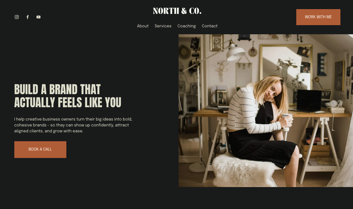
Header + Hero Example
2. Hero Section
Your hero section is the first thing people will see when they land on your homepage. It’s the section that sits below your header and is visible before having to scroll down. It sits ‘above the fold’ to use web design jargon.
So it’s a super important one. HERO - clue in the name.
I often see this section being used to repeat their business name or say something like ‘welcome to my website’. And whilst this is all very nice, it doesn’t really help people understand what your website is all about. So it’s a bit of a waste of this important space.
It wants to super clearly state who you are, what you do, who you do it for and how you can help.
Focus on the results your customers will get - and keep it tangible, not fluffy and abstract.
Example: copywriter
Fluffy = Copywriting to help you stand out online.
Strategic = Website and email copy that turns curious browsers into paying clients - for coaches, consultants, and creatives who want clarity and conversions.
Example: Counsellor
Fluffy = Supporting you on your journey and helping you feel better.
Strategic = Person-centred counselling for adults navigating anxiety, burnout, and major life transitions - so you can feel grounded, resilient, and more like yourself again.
Example: Business coach
Fluffy = Helping you reach your goals and unlock your potential.
Strategic = Coaching for early-stage service-based founders who want to build a sustainable business, raise their prices, and create consistent monthly income.
Do you see the difference? Fluffy hero blurbs sound nice but they don’t really say anything.
Using vague phrases like ‘to help your business grow’ could mean anything. And this means your visitor has to work harder to figure out who you are, what you do and crucially if you are the right person for them to work with.
Most people give a website 3–5 seconds before deciding to stay or leave.
So if your homepage doesn’t answer the basics immediately, your visitor often clicks away - and not because you’re not the right fit but because you weren’t super clear.
Strategic hero copy removes all the guesswork.
It’s specific, grounded, and written with your actual ideal clients in mind. It says exactly what you offer, who you help, and why it matters - building trust far quicker than any flowery language ever could.
Clarity over cleverness every time.
3. Detailed Footer
Detailed Footer Example
The humble footer. This is possibly the most frequently neglected area of most DIY websites.
Think about it…the goal of your website is to keep visitors engaged until they take action… so when someone has scrolled all the way down to the bottom of a page - what happens next? Where do they go? What should they do?
Your footer should act like a little information hub, guiding people to towards their next step.
It is prime website real estate. And it’s on EVERY SINGLE PAGE. So use it.
Things you could include on your footer:
Your logo (with a link back to your homepage)
A one line description of your business/mission
Your location (if relevant)
Contact details
Email sign up form
Social links
Primary navigation (the same links as your header)
Secondary navigation (privacy policies, any other pages not in your main menu)
If you’re reading this and thinking, cool - Yep, I know some parts of my website could be clearer, but where do I even start? It’s all good - cos you don’t need to figure all of this out alone.
I’ve put together a free, super simple guide on how to design and write an awesome homepage. It’ll walk you through the key areas most small businesses overlook (without the stress and overwhelm)
Written by a human, not a robot.
All my blogs are ai free and written by me, Ishbel, a real life human living in Glasgow.
So please excuse any typos or bad grammar!!